Using the wolf\sheep simulation as a bench mark I wanted to correct the size of view to make it clearer and game-friendly. NetLogo has a Icon editor that populate one patch. If the icons look to small, the game will be unplayable.
To understand how to make the view look bigger Tutorial 1 covers how the world is sized. As with logo, the center square is 0,0. We can setup the world to be any size height or width. Each location, or patch, is defined by a size also, so the apparent size of each square can be made larger or smaller.
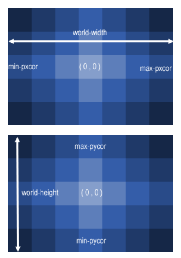
I wanted to make the icons of the wolf/sheep simulation bigger, so they look like a ‘game’ size icon on my screen. First I loaded the wolf/sheep simulation with the default values and ran setup.
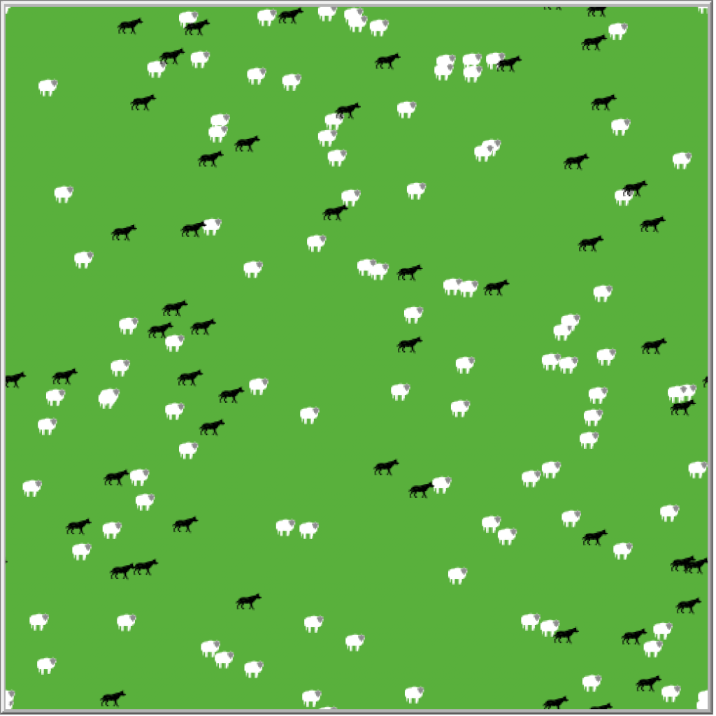
Whilst I can see that these are wolf and sheep, the icons still seem a little small for my liking. I can see that there world view is form of 25 patches in each direction and the patch size is 10. So I can fit allot of patches into a small space, but not allot of detail of the icons/turtles themselves.
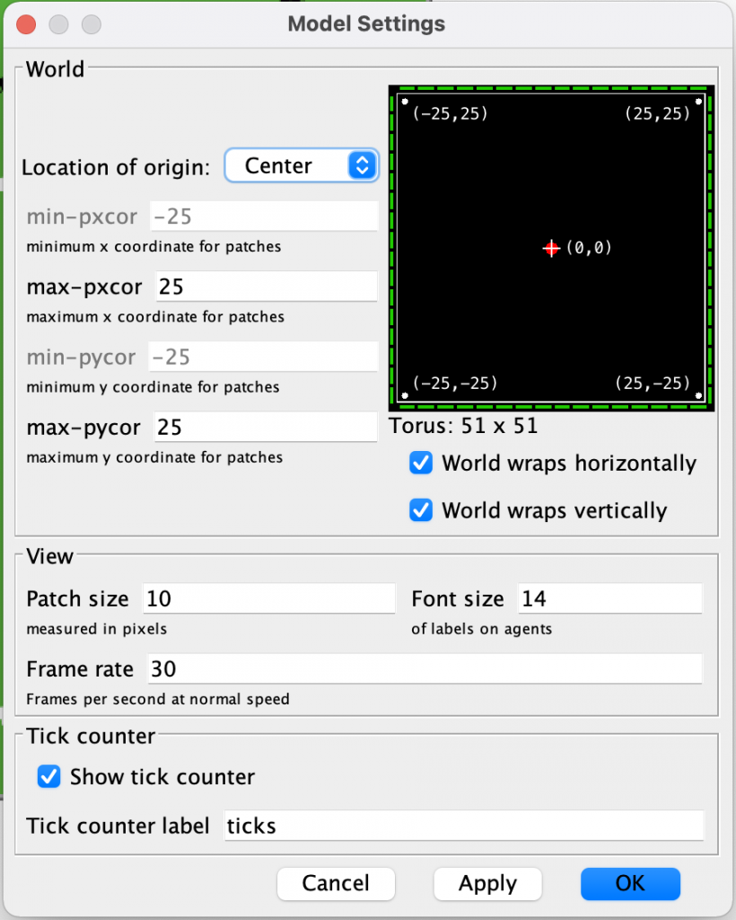
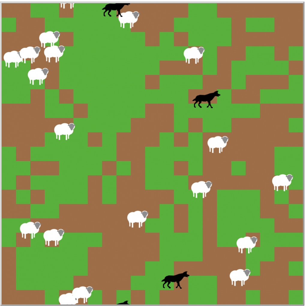
If I reduce the world to 10 and the patch size to 44, i effectively reduce the size of the world by half, and increase the size of patches by 4.
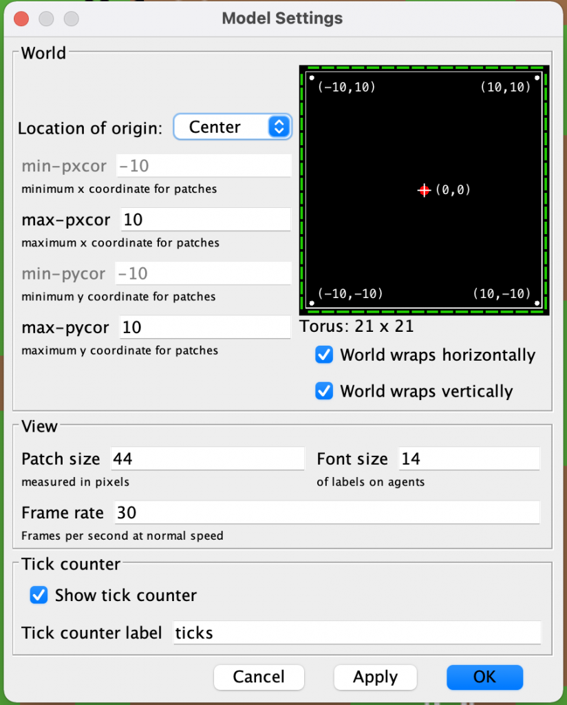
This results in being able to see much clearer detail of the wolf and sheep turtles and each tile, making a better gaming experience in the NetLogo world that has been created.
What is brilliant about this is that to the developer using the Netlogo UI, there is no change in the logic code that drives the netlogo simulation, of course there has been changes which can be seen when editing the the wolfsheep.nlogo file, but these are created by the setup dialogue.
This is a very effective way of making the world scalable and useable in a well designed development user interface.
